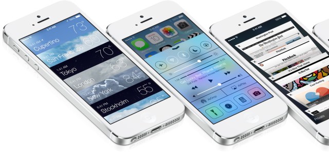
Users of Apple’s iPhone, iPad and iPod touch devices got their first look at the company’s newest operating system, iOS 7, earlier today "june 10".
Not only has Apple given iOS an entirely new look and feel, courtesy of head designer Jonathan Ive, but it has also revealed a revamped suite of core apps like Photos, Camera, Calendar, Weather and others, added new services like iTunes Radio and features like AirDrop, while also making it less lucrative for would-be thieves to steal your iPhone, and much more.
During this morning keynote’s, company execs walked users through some of the biggest changes arriving in iOS 7, which launches in beta for iPhone developers today, with a larger public release expected this fall.
Here are some of the best new features and updates you can expect when iOS 7 ships later this year.
A More Modern Design
Let’s get this out of the way first: love it or hate it, the biggest change is the one we knew was coming – skeuomorphic design is dead. The new operating system has been redesigned from head to toe in a flatter — but not a totally flat — design as some had feared. Instead, there’s a transparency effect in place in many screens, and when you move the device in your hand, iOS now tracks the motion, allowing you to see behind the icons. This is great for background wallpapers, for example, as you’ll get to see more of your favorite homescreen photo previously hidden behind the apps.

Overall, the look is cleaner and simpler in many ways — the ugly green felt is gone from Game Center, for example. It is one of the most-hated apps in terms of being representative of the older, “skeuomorphic” design, which attempted to make apps familiar to users by coating them with elements from the real-world (like leather stitching, felt or yellow-lined notepad paper). The company took several digs at the old style in the process of introducing the new, as well. To be sure, there was no “evolution” at play here — this was murder.
Let’s get this out of the way first: love it or hate it, the biggest change is the one we knew was coming – skeuomorphic design is dead. The new operating system has been redesigned from head to toe in a flatter — but not a totally flat — design as some had feared. Instead, there’s a transparency effect in place in many screens, and when you move the device in your hand, iOS now tracks the motion, allowing you to see behind the icons. This is great for background wallpapers, for example, as you’ll get to see more of your favorite homescreen photo previously hidden behind the apps.

Overall, the look is cleaner and simpler in many ways — the ugly green felt is gone from Game Center, for example. It is one of the most-hated apps in terms of being representative of the older, “skeuomorphic” design, which attempted to make apps familiar to users by coating them with elements from the real-world (like leather stitching, felt or yellow-lined notepad paper). The company took several digs at the old style in the process of introducing the new, as well. To be sure, there was no “evolution” at play here — this was murder.
iOS Gets A Back Button (Sort Of)
With an idea borrowed from several third-party iOS apps and BB10 (if you can believe it), the new version of the operating system now has a “back button” of sorts. Except it’s not a button really, it’s a gesture. Unlike on Android, where devices offer a dedicated software or hardware button for the function that means “go back to the previous screen,” the iOS back function is there when you need it but doesn’t clutter up the screen when you don’t.
Instead of a button, you swipe in from the left side of the screen (bezel to screen) to invoke the feature. It works in places you would expect, such as the Safari web browser, as well as in apps like Mail, and elsewhere.
Upgraded Default Apps
Apple has responded to the growing number of apps meant to serve as an alternative to Apple’s default set (think Calendar, Weather, Mail, Messages, etc.) with an overhaul of all its apps that ship with iOS devices out of the box.
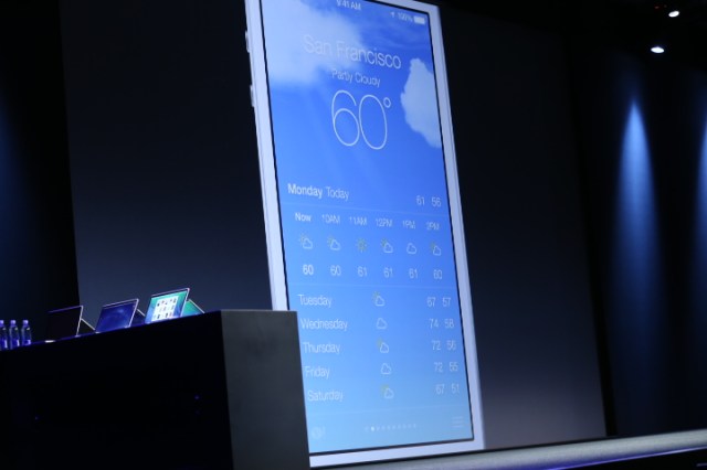
Many of these seems inspired by some of the more popular applications in its own App Store, too, if not directly built by third parties, as the new Yahoo-powered Weather app is. Though not identical to the Yahoo Weather app in iTunes (which is arguably one of the highest-rated weather apps of all time), the new native Weather app shares a lot of the design elements, but replaces Flickr photo backgrounds for those of weather animations like rain or snow — also much like Android’s live weather widgets allow for today.
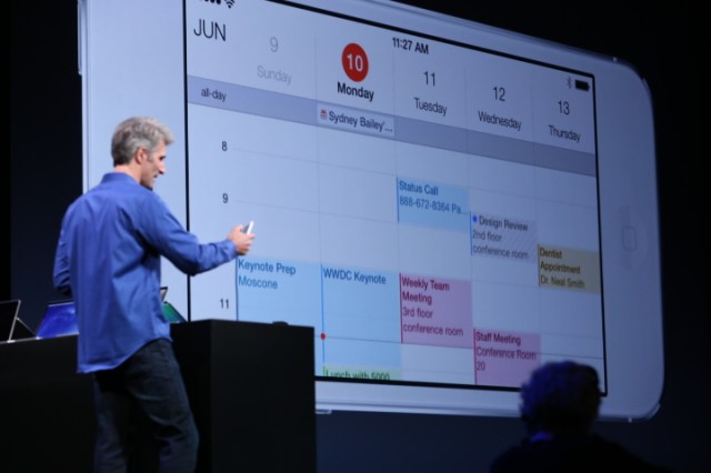
The native calendar app, now clean and white (and a lot like Sunrise), lets you swipe between days, turn to landscape to see a week in advance and zoom out to see your month or year.
Mail, meanwhile, offers big, edge-to-edge photos when used for photo-sharing and lets you take action on inbox messages with a swipe, which is a feature that earlier earned third-party app Mailboxan exit to Dropbox for around $100 million.
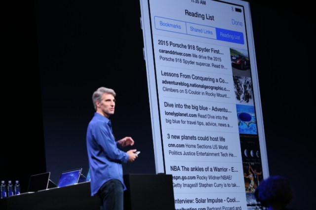
Safari got a big revamp too, with fancy 3D-esque tab-switching behavior, improved bookmarking, one-tap access to favorites, and even Twitter integration which lets you see which links your Twitter friends are reading and sharing.
The camera, meanwhile, has been updated with built-in Instagram-like filters, and the ability to swap between the different camera modes like “panoramic” or the new “square” camera view.
Apple has responded to the growing number of apps meant to serve as an alternative to Apple’s default set (think Calendar, Weather, Mail, Messages, etc.) with an overhaul of all its apps that ship with iOS devices out of the box.
Many of these seems inspired by some of the more popular applications in its own App Store, too, if not directly built by third parties, as the new Yahoo-powered Weather app is. Though not identical to the Yahoo Weather app in iTunes (which is arguably one of the highest-rated weather apps of all time), the new native Weather app shares a lot of the design elements, but replaces Flickr photo backgrounds for those of weather animations like rain or snow — also much like Android’s live weather widgets allow for today.

The native calendar app, now clean and white (and a lot like Sunrise), lets you swipe between days, turn to landscape to see a week in advance and zoom out to see your month or year.
Mail, meanwhile, offers big, edge-to-edge photos when used for photo-sharing and lets you take action on inbox messages with a swipe, which is a feature that earlier earned third-party app Mailboxan exit to Dropbox for around $100 million.

Safari got a big revamp too, with fancy 3D-esque tab-switching behavior, improved bookmarking, one-tap access to favorites, and even Twitter integration which lets you see which links your Twitter friends are reading and sharing.

The camera, meanwhile, has been updated with built-in Instagram-like filters, and the ability to swap between the different camera modes like “panoramic” or the new “square” camera view.
Photos & iCloud Photo Sharing
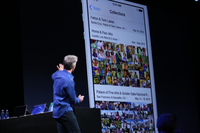
Though technically another default app update, the revamped Photos app deserves a deeper look because photo-taking is one of the iPhone’s (and all smartphones, really) most-used features. The Camera Roll itself has now been improved, organizing photos into “Moments” based on location and time – again, a feature inspired by the work of a number of third-party apps including Cluster, Moment.me, Flock, Tracks, flayvr, and others.
These collections will be auto-labeled with locations you visit. In the demo, that included venues like the Golden Gate Bridge and the Palace of Fine Arts, as well as your home and your kid’s elementary school, for example. But as you zoom out to take a broader view, the locations merge together by date, letting you zoom all the way out to the year view where you can scroll and scrub through the photos, then tap to go into any one.
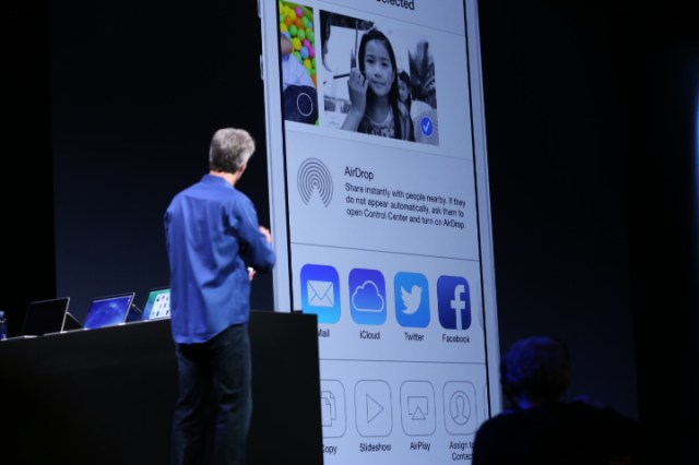
Built-in to this new experience is something called Air Drop, which is a new way to share photos with other iPhone users. (The poke at Android users: “there’s no need to wander around the room bumping your phone.”) Instead, photos and videos can be shared peer-to-peer over Wi-Fi connections with nearby users on newer iOS devices; they can also be shared via Facebook, Twitter, email, and into iCloud photo streams.
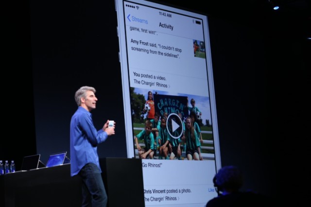
The photo stream was one of iOS’s lesser understood features among mainstream users, but the update makes it more accessible, allowing multiple users to contribute both photos and video, as well as comments to a shared stream.
Though technically another default app update, the revamped Photos app deserves a deeper look because photo-taking is one of the iPhone’s (and all smartphones, really) most-used features. The Camera Roll itself has now been improved, organizing photos into “Moments” based on location and time – again, a feature inspired by the work of a number of third-party apps including Cluster, Moment.me, Flock, Tracks, flayvr, and others.
These collections will be auto-labeled with locations you visit. In the demo, that included venues like the Golden Gate Bridge and the Palace of Fine Arts, as well as your home and your kid’s elementary school, for example. But as you zoom out to take a broader view, the locations merge together by date, letting you zoom all the way out to the year view where you can scroll and scrub through the photos, then tap to go into any one.

Built-in to this new experience is something called Air Drop, which is a new way to share photos with other iPhone users. (The poke at Android users: “there’s no need to wander around the room bumping your phone.”) Instead, photos and videos can be shared peer-to-peer over Wi-Fi connections with nearby users on newer iOS devices; they can also be shared via Facebook, Twitter, email, and into iCloud photo streams.

The photo stream was one of iOS’s lesser understood features among mainstream users, but the update makes it more accessible, allowing multiple users to contribute both photos and video, as well as comments to a shared stream.

iTunes Radio
Everyone had been calling it “iRadio” ahead of today’s announcement, but the feature’s official debut is worth noting even if the surprise was spoiled. As expected, iTunes Radio is very much a Pandora-like experience built on top of the iTunes music catalog and forged through new deals with the major record labels. Like most streaming music apps on the market, you can play pre-loaded stations by genre or create your own “artist radio” station, skipping and favoriting songs to teach the service your own likes and interests.
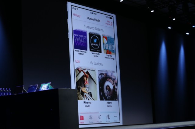
What Apple’s iTunes Radio does differently is that it also ties you back to the iTunes store, allowing you to “wishlist” your favorites, and purchase those tracks you want to hear on demand. The app is free and ad-supported, but ads are removed for iTunes Match subscribers.
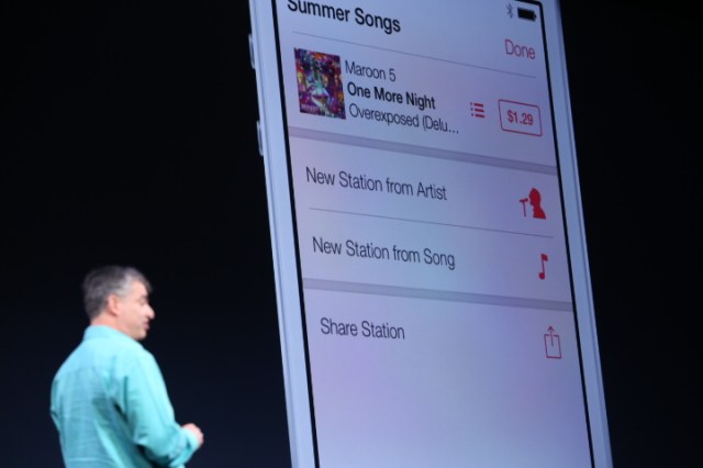
Everyone had been calling it “iRadio” ahead of today’s announcement, but the feature’s official debut is worth noting even if the surprise was spoiled. As expected, iTunes Radio is very much a Pandora-like experience built on top of the iTunes music catalog and forged through new deals with the major record labels. Like most streaming music apps on the market, you can play pre-loaded stations by genre or create your own “artist radio” station, skipping and favoriting songs to teach the service your own likes and interests.

What Apple’s iTunes Radio does differently is that it also ties you back to the iTunes store, allowing you to “wishlist” your favorites, and purchase those tracks you want to hear on demand. The app is free and ad-supported, but ads are removed for iTunes Match subscribers.

Siri Gets Smarter
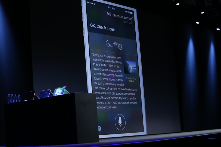
There wasn’t as big a focus on Siri as is needed (at least in the keynote demo), but the feature has gotten new male and female voices, which can now speak French and German with more languages coming “in time.” Notably, the service can now control more of your device, including playing back your voicemails, turning on or off things like Bluetooth, increasing or decreasing screen brightness and more.
It has also now integrated Twitter, Wikipedia and search results from Bing, so it can do things like read you Wikipedia entries or pull up web results.

Anti-Theft Features
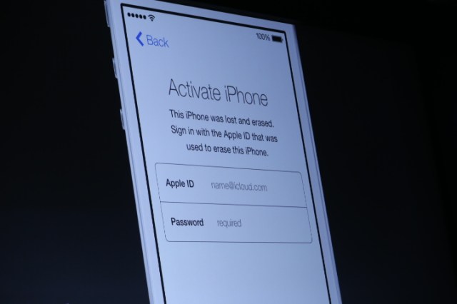
The iPhone’s popularity and high resell value has led to it being one of the most stolen devices, too, but Apple’s new security upgrade is meant to make at least petty crime involving stolen iOS devices not worth criminals’ time and effort. Apple said that hundreds of millions use “Find my iPhone,” but as we know, thieves simply turn off devices and wipe them before re-selling them.
With a new “Activation Lock” setting, a thief won’t be able to reactivate an iPhone without hacking your iCloud user name and password, too. Although no security mechanism is bullet-proof, this makes it just hard enough to deter casual criminals or crimes of opportunity — like the phone that gets left behind at a bar, maybe?

A Better Notification Center
The notification center drop-down has also gotten a makeover, but considering how often users check this screen it’s surprising it didn’t get more show time this morning, when its new feature set was revealed. That being said, the center now splits your notifications more intelligently between top-level categories like “All,” “Missed,” and “Today,” the latter giving you a day-at-a-glance view into your To-Do’s, plus Stocks, Calendars, Weather and a small preview of Tomorrow at the bottom.
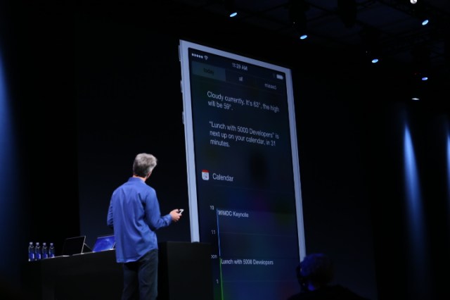
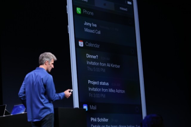
The notification center drop-down has also gotten a makeover, but considering how often users check this screen it’s surprising it didn’t get more show time this morning, when its new feature set was revealed. That being said, the center now splits your notifications more intelligently between top-level categories like “All,” “Missed,” and “Today,” the latter giving you a day-at-a-glance view into your To-Do’s, plus Stocks, Calendars, Weather and a small preview of Tomorrow at the bottom.


Easy Access Controls
A new gesture — a swipe up from the bottom of the screen — will now launch a “Control Center” interface which is like an easier-to-access Settings area. The ability to quickly dive into your Settings is a feature that Android phones have had forever, and iOS users have been clamoring for. Here, you can quickly tap things like “Airplane Mode” or access your Wi-Fi controls, for example, as well as a built-in flashlight (hooray!) and media player controls.
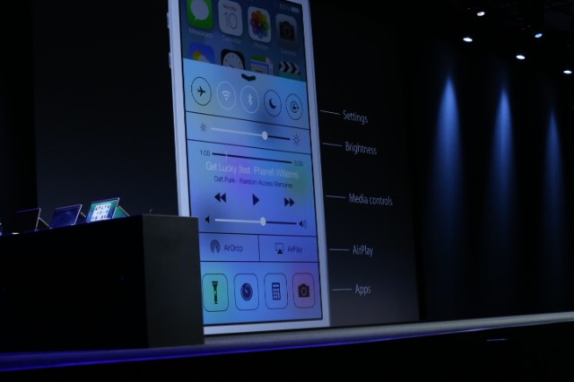
A new gesture — a swipe up from the bottom of the screen — will now launch a “Control Center” interface which is like an easier-to-access Settings area. The ability to quickly dive into your Settings is a feature that Android phones have had forever, and iOS users have been clamoring for. Here, you can quickly tap things like “Airplane Mode” or access your Wi-Fi controls, for example, as well as a built-in flashlight (hooray!) and media player controls.

Intelligent Multi-Tasking
Before, the multi-tasking interface accessed by a double tap of the home button brought up a small rack of app icons running in the background. Today, it displays large windows showing the app’s interface in action instead. More importantly, multi-tasking has gotten smarter without damaging battery life, Apple claims.
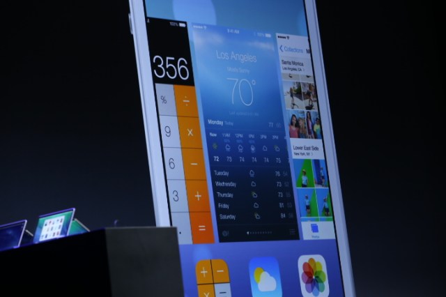
Now all apps are able to run in the background, and iOS 7 learns from your patterns of app usage which ones deserve a more regular update. For example, an app you check often like Facebook will be updated more regularly than one you check once or twice per day. In addition, the apps update this information based on other factors, too, like whether you’re in an area with good cell coverage or whether or not you tend to respond to that app’s push notifications. All these things tie in to train iOS 7 to learn which apps are most important to you.
Before, the multi-tasking interface accessed by a double tap of the home button brought up a small rack of app icons running in the background. Today, it displays large windows showing the app’s interface in action instead. More importantly, multi-tasking has gotten smarter without damaging battery life, Apple claims.

Now all apps are able to run in the background, and iOS 7 learns from your patterns of app usage which ones deserve a more regular update. For example, an app you check often like Facebook will be updated more regularly than one you check once or twice per day. In addition, the apps update this information based on other factors, too, like whether you’re in an area with good cell coverage or whether or not you tend to respond to that app’s push notifications. All these things tie in to train iOS 7 to learn which apps are most important to you.
…And More
There are a number of new features which Apple didn’t have time to go through today, including FaceTime and iMessage blocking, per-app VPN capabilities for the enterprise, and more, but these are “icing on the cake” type of features on top of those given special attention today. In the weeks ahead, we’ll know more about some of these minor upgrades, as developers begin their beta tests of the new operating system and other details emerge.
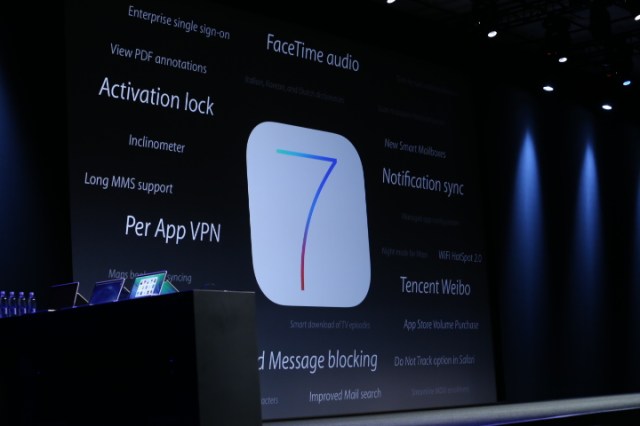
There are a number of new features which Apple didn’t have time to go through today, including FaceTime and iMessage blocking, per-app VPN capabilities for the enterprise, and more, but these are “icing on the cake” type of features on top of those given special attention today. In the weeks ahead, we’ll know more about some of these minor upgrades, as developers begin their beta tests of the new operating system and other details emerge.

Data source: via TC (BY SARAH PEREZ)

No comments:
Post a Comment